South Australian Museum

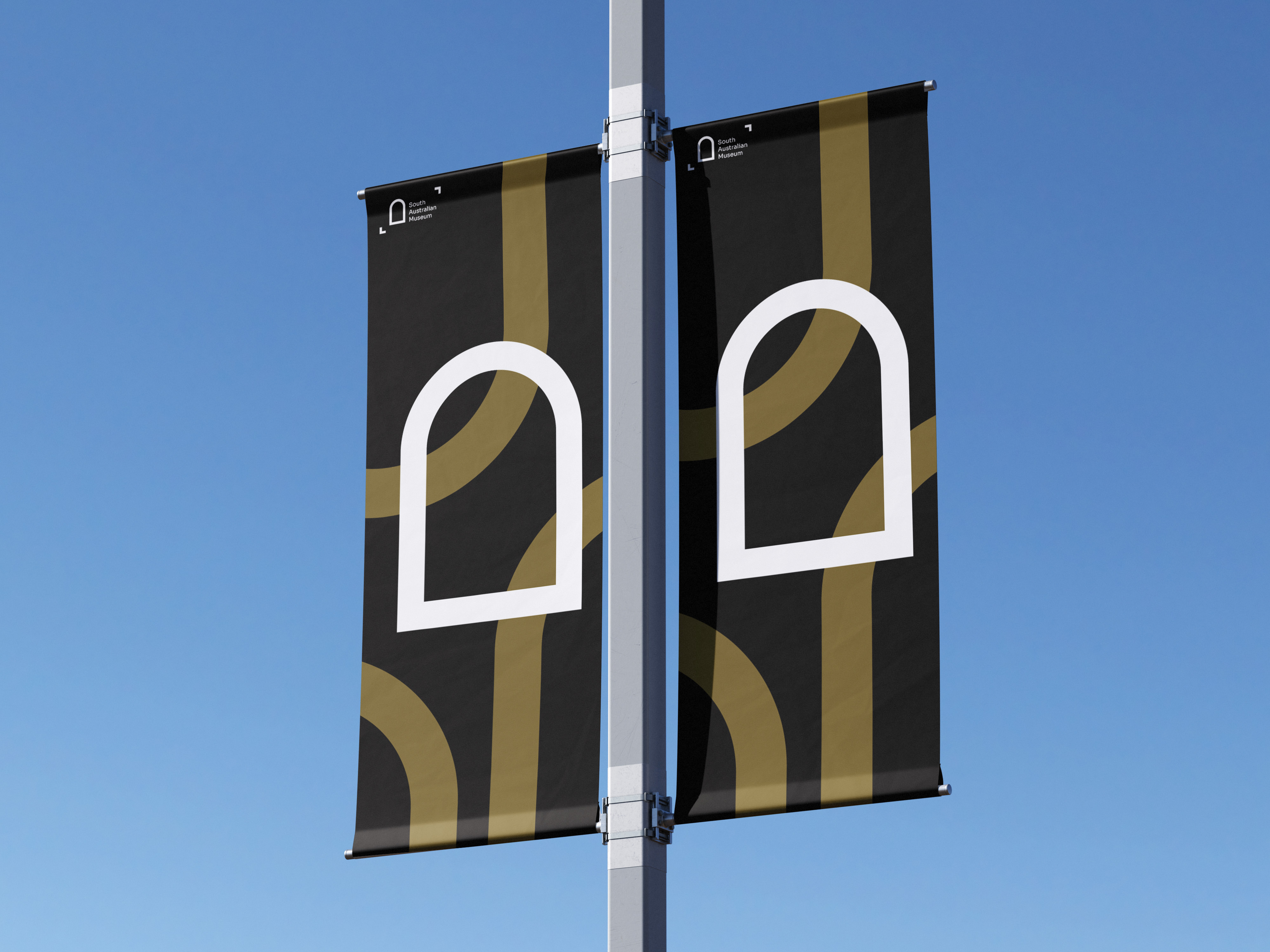
The South Australian Museum rebrand modernises the institution’s visual identity while preserving its history, curiosity, and cultural significance. At its core is a simplified arch motif, inspired by the Museum’s original architecture, a symbol of discovery and connection between the natural and human worlds. The logo invites visitors to look closer, step through, and uncover what lies beyond. A modular pattern system, derived from the logo’s geometry, creates a cohesive visual language across print and digital applications. This reflects pathways of exploration and interconnectedness, adding depth and flexibility to all communications. The refined colour palette pairs deep natural tones with clean neutrals, echoing the Museum’s environment and diverse collections. Modern typography and a structured layout system ensure clarity, accessibility, and consistency across signage, brochures, and digital platforms. The wayfinding system builds on the brand’s geometry to guide visitors seamlessly through the Museum. Using the arch motif, clear type, and colour coding, the signage reinforces the new identity while enhancing navigation. The rebrand positions the South Australian Museum as a contemporary cultural landmark, one that celebrates curiosity, learning, and connection through timeless, modern design.


